Wednesday, 14 August 2013

Graphic Design and its role in the South African economy

Design has always played a role in how a society functions in relation to its surroundings. Graphic Design is a term first coined by William Addison Dwiggins in 1922. It is a discourse in which a designer seeks to convey a message to an audience specific to the client. While the discipline has witnessed tremendous growth and acknowledgement around the world for its role in driving the economy, South Africa has only just begun to understand its importance. South Africa is yet to see design as a powerful national resource. The discipline can assist the nation into developing local markets, competing on a global market place and meeting the requirements of social reconstruction. Graphic Design should begin to take a pivotal position in the South African economy. Since Graphic Design is so young in the country, it is only beginning to find its unique creative expression. The expression was evident during the world cup through campaigns such as ‘Fly the Flag’ and ‘Football Friday’. This also demonstrated the passion which the Nation can exude when behind a credible and cohesive brand image. Now imagine if that same kind of immense energy and unity could be channelled by the country through its national 
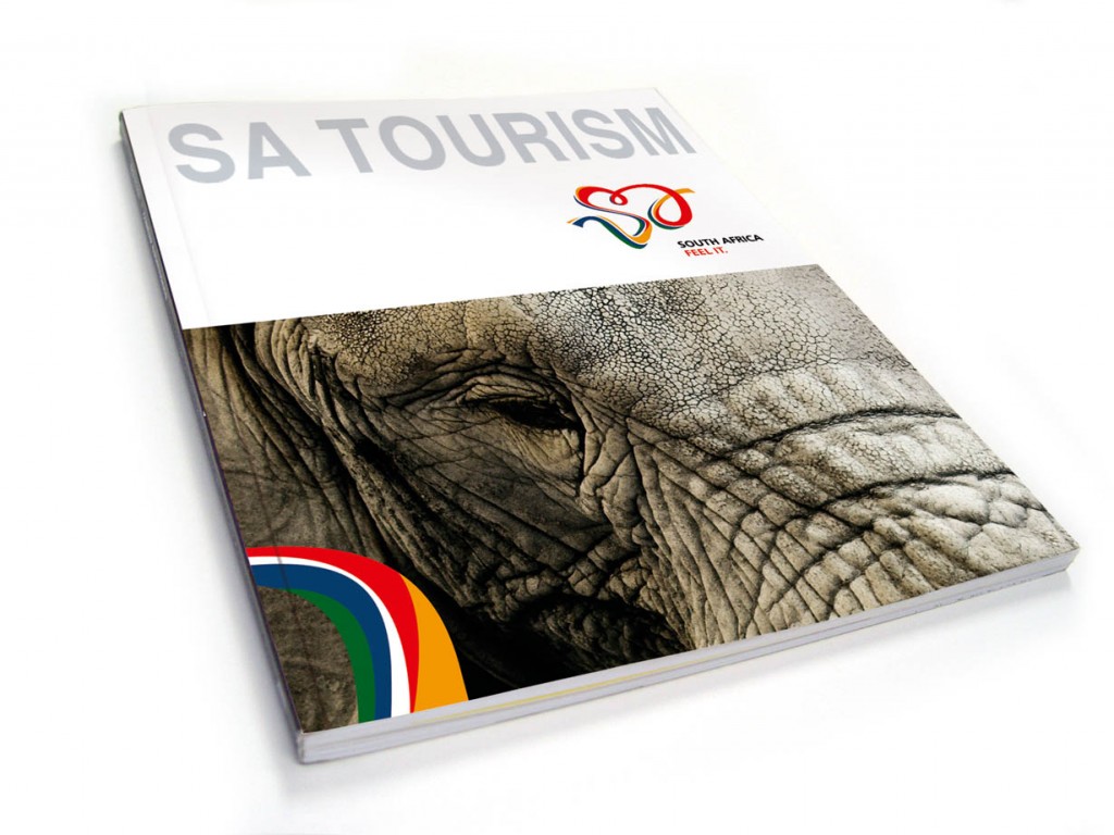
branding initiative. There is no doubt in my mind that the South African brand lacks that unique visual nuance to make it unforgettable.  There is a vast amount of Graphic Designers and design houses in the country which would be more than willing to assist in re-branding the nation. The evidence can be found in Design Indaba’s Brand the Beloved Country initiative and the amount of visual material designers create themed around the national flag.

Refferences:

Marian Sauthoff, 2004, Walking the Tightrope: Comments on Graphic Design in South Africa, Design Issues: Volume 20.

Friday, 9 August 2013

South Africa and the 2010 FiFA World Cup

The FIFA World Cup is a chance for soccer fanatics to kick back their shoes and watch back-to-back soccer matches for a whole month. The hosting country on the other hand has to be up on its feet the whole time to not only making sure that the event runs smoothly, but also has a positive impact on the country’s image. The 2010 World Cup was hosted by none other than South Africa and the country was hoping that the event would have a long lasting effect on its business, tourism and overall brand. The main aim of hosting the event was for the country to embed its image into foreign minds. An important aspect of pulling this of was for South Africa to get its citizens in on the campaign and live out the brand in order to make it more enticing. So the country started their branding efforts a year prior to the event with a television commercial bearing the slogan “It starts with you”.

Melanie McShane [1]states that sport is the new way to promote a country to its counterparts. Countries such as Spain are using their famed football clubs to start conversation among potential tourists and lure them into their shores. With teams such as the world renowned Barcelona Football Club on their side I would say that it is indeed a wise marketing strategy.

Whilst an event of World Cup magnitude brings about positive aspects it can also expose a country to criticism. It sets the tone for a country to deliver an unrivalled sporting event. Melanie McShane also equates hosting such an event to letting people into your home where they are able to see all the clean rooms, but also the untidy little corners. In the South African context those untidy little corners would be the nation’s sky high crime rate and rational inequalities which still exist to this day nearly twenty years post-apartheid.
After winning the bid to host the world cup South Africa sought help on branding the event from IMO[2] for this task the agency consulted private companies such as Uniliver for tips on how to create a unified brand.  Their branding strategy for the country included approaching it like a company looking to get listed on the London Stock Exchange. In their defence for using this tactic IMO stated that approaching Uniliver for advice on branding was inspired by the fact that the company is global while still retaining a local identity and loyalty. This is an argument which is plausible to me since I thought, for the longest time, that Uniliver was a South African company. Although the world cup played a pivotal role in South Africa’s branding McShane agrees that it should act as an opportunity for the country to reposition itself and look beyond the event to build on what has been established. Anitha Soni from the International Marketing Council (IMO) believes that had South Africa publicised a strong united brand it would have helped the country to have a stronger presence on a global scale. 

This post was inspired by Jo Roberts article'South Africa united behind a single brand'.


[1] She is a strategist at Wolff Olins.
[2]]The International Marketing Council of South Africa, which is also responsible for Brand S.A.

Reference

marketingweek.co.uk


Wednesday, 7 August 2013

Blasphemy in Graphic Design

I recently read a blog by my peer Paul Nyetanyane. He is a fellow Graphic Design student at Nemisa. His blog is themed around blasphemy, a controversial topic which puts the strongly religious against those who favour bending the rules as far as they can be, but before I delve deeper into the issue let us first define the word. Wikipedia defines blasphemy as "the act of insulting or showing contempt or lack of reverence for a religious deity, irrelevance towards something considered sacred or inviolable". Paul is focusing of blasphemy in art more specifically that which seems to be pertaining to Christianity.

Christian theology condemns the act and some are deemed as unforgivable in the bible such as speaking ill of the holy spirit (Mark 3:29). The most recent modern work of art which has been deemed as blasphemous is that of American L.A native rapper The Game's new album titled Jesus Piece. It has been stylised to look like stained glass art, an art form which reached its prime during the middle ages where it was a major pictorial form used to illustrate the narratives of the bible to a largely illiterate populace. The controversy the stylised black Jesus on the album cover caused especially amongst Christians is remarkable. Whilst I personally feel that blasphemy is a subjective issue we have to ask the following question; where do we draw the line between freedom of expression and offensive material? It is an interesting topic indeed. If you want to read more on his topic here is the link http://paulnkhabu.wordpress.com/

References: 

http://en.wikipedia.org/wiki/Blasphemy
http://en.wikipedia.org/wiki/Jesus_Piece

Friday, 2 August 2013

Brand the Beloved Country

Brand the beloved country is an idea fashioned to reflect how South Africa has become one of the most liberal societies in the world. The idea belongs to Ravi Naidoo, the founder and managing director of Design Indaba. He came up with it in 2001 and the name was inspired by Alan Paton's book Cry the Beloved Country which is about race-torn South Africa during apartheid. The turn of democracy in the country and homage paid to the book by Design Indaba would indeed have made the author proud. Despite the turn of events, what Design Indaba noticed is that the country is still rife with old stereotypes, opinions, and outdated facts. Basically the nation was still and still is being judged by circumstances which it overcame years ago. The country was and still is in need of a branding campaign, hence the Brand the Beloved Country initiative by Design Indaba to give the country an image well suited to its current status. 

The revelation came to Ravi Naidoo after working on a project for the World Cup bid prior to South Africa winning it in 2004. He realized that global perceptions of the country were farfetched and the country was thought to be Afro-pessimistic. With this information Design Indaba set out on a quest to find a solution to this problem by Commissioning three of the top design agencies in the country at the time in 2005 to come up with a branding campaign for South Africa. They then had to pitch this campaign in 2006 to a wide panel of judges. The premise to this branding was "Real Freedom". With the knowledge, creative freedom and ample amount of time given, each design house set out to create a unique solution. The Results are as follows:

The first idea from HKLM


They decided on using the idea of a viewfinder for the logo to depict real freedom. It allowed them to capture a range of elements that reflect South Africa from the diverse heritage to the warm smile of the people. For the typeface they found a letter that Mandela had written to his daughters while incarcerated on Robin Island. In the letter he had written the words 'South Africa'. They then extracted these two words to create a unique logo-type. 


The second idea from Two Tone

They chose to look at all the national symbols in the country and chose one which would embody freedom and be easily recognizable. They decided on the national bird, The Blue Crane, and then fused it with the vibrancy of the flag to create a new identity. The brand extension is of international quality sure to lure in new investors.


The third idea from Switch

They went with doing a logo-type for this campaign with the abbreviated version of the name South Africa, i.e. S.A. and the colors found on the South African flag. The letters were drawn in a free flowing swirl capturing the personality of the nation. If you look carefully you will find that the negative space inside the type forms a heart. It is a little cliché, but cute nonetheless. The brand extension is playful enough to pull at the heart strings of South African citizens. 

Although none of these was implemented, each one has a unique element and styling to it. The first one is unique and very conceptual with little element that make it distinct. The second one by Two Tone is of international standard, you can see it amongst the big boys holding its own ground. The third one is just fun and it ignites a feeling of happiness in the right direction. This initiative was a step in the right direction towards South Africa finding an identity that works.

 Refference and images:

Monday, 22 July 2013

NBI (Nation Brand Index)

Countries are constantly in competition with each other to attract investors, tourists and build up an image for themselves to inspire support from their respective citizens. The success of a country in doing so is measured using the NBI (Nation Brand Index). The NBI was developed by Simon Anholt a world leading specialist in creating strategies for countries, cities and regions. When it was launched in 2005 it was referred to as the ‘Simon Anholt Nations Brands Index’ and it was fielded four times a year.

Nation branding is practised by many states including South Africa, America, Europe, Canada, France, Japan, China etc. In these countries it is officially referred to as public diplomacy. These Countries Governments have resources dedicated to nation branding. They do this in hopes that it will improve their global standing, as a well put together image of a country can influence its success in attracting investment, tourism and increase its political influence in the world.

The NBI is also parent to another survey known as the ‘Monocle Soft Power Survey’ which was established in 2009. This survey ranks nations according to their attractiveness and level of influence on the world. The following elements of a country are evaluated: Diplomatic infrastructure, cultural output, level of governance, appeal to business and capacity of education. The list is then calculated with the use of an estimated fifty factors which indicate the use of soft power. These factors include but are not limited to: Olympic medals, cultural missions, business brands and the quality of country’s architecture.


South Africa is not doing too well on either of these surveys. On the NBI it is sitting at number thirty six and on the Monocle Soft Power Survey it is at number twenty. South Africa did not make it to the top ten of either survey. This essentially means that South Africa has very little influence globally despite the fact that it is the largest exporter of gold, other minerals, and has and internationally revered political icon in the form of Nelson Mandela. South Africa has all the potential to make it to the top of the rankings yet it lacks what it needs most at this point; a carefully articulated and successful brand image.

References:

Monday, 15 July 2013

Branding South Africa


Have you ever thought about whether countries brand themselves, and how some manage to keep their image intact no matter what situation they come across? Well then just like companies have structures in place to promote and maintain their image countries do the same, but the only difference is the type of branding countries undertake is slightly different and referred to as 'policy based branding. What this essentially means is that all the money spent on it directly benefits the economy.

Every country is united under its largest symbol, its national flag. The flags are symbolic representations of everything the country stands for and it is also through these flags that countries identify each other e.g. In the South African flag the black, yellow and green are colours used by the democratically elected ruling party the ANC, the other three colours red, white and blue were used on the old flag of Transvaal, and the blue and white were also found in the old South African Flag. This fusion of colours signifies a country embracing its past, present and future. Some countries such as America have created successful brand extensions of these flags with strategic placement for maximum visibility e.g. the uniform worn by the American Olympic team. This allows them to imprint their brand image on everyone’s mind repetitively.

South Africa has been trying to build a brand for itself of similar calibre ever since 2002 when Brand S.A was established. It is a marketing initiative mandated by former president Thabo Mbeki to Change the country’s image locally and internationally. Unfortunately it has not achieved much within the last decade, which is disappointing considering the ample amount of time and money given to the cause. My research paper seeks to understand why South Africa’s image has remained stagnant and how it can be saved.

References: 
http://en.wikipedia.org/wiki/Flag_of_South_Africa


Tuesday, 9 July 2013

Fable Font Creation


I have recently undertaken a personal task to design a decorative font, for my own amusement. It came about when I was tasked with the production of a logo for a perfume. It was one of my two strongest ideas, but obviously one got chosen over this one. Fable always stuck out in my mind though, there was a childlike innocence about it which I liked a lot, hence me carrying out the initial idea and extending it into a full font.

The term fable is defined as a short story, typically with animals, inanimate objects, plants or forces of nature conveying a moral. A fable is one of the most enduring forms of folk literature; they can be found almost everywhere. They are most often stories passed down from parent to child throughout generations, one that I can vividly remember being told by my grandmother is that of ‘The Tortoise and The Hare’ a story that I’m sure most are familiar with.

The inspiration behind the font is the popularized cartoon depiction of a beehive, derived from Skeps which originated two thousand years ago. These structures are made of straw and meant to protect the honeycomb which the bees produce inside the Skep.

The font can be used to write titles for a series of kids books and products which would be extensions of these books. I will post the rest of the font when I am done with it, but for now below are pictures of the inspiration and what is to come.

a Skep.

 Cartoon beehive.
Font outline.Fable Font.